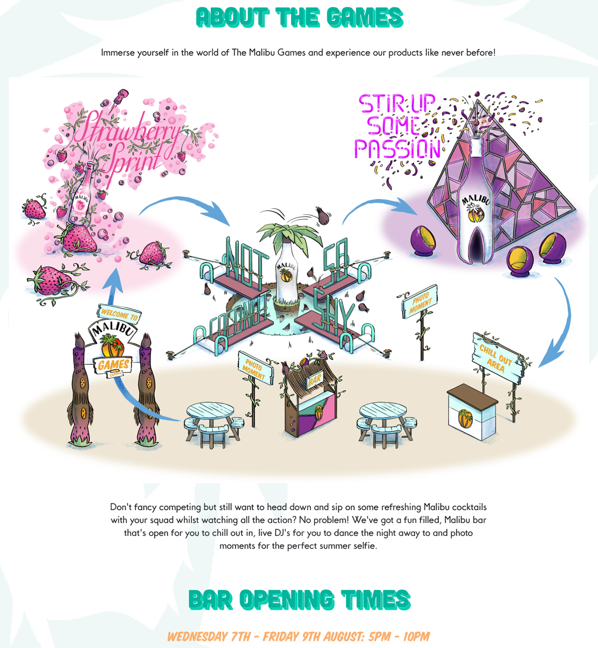
Below you will find an in situ of my final illustration as well as early sketches and concept of how it came to life. You can see the illustration live on the website here >> MALIBU GAMES 2019 <<
Final Artwork you can find on the Malibu website.
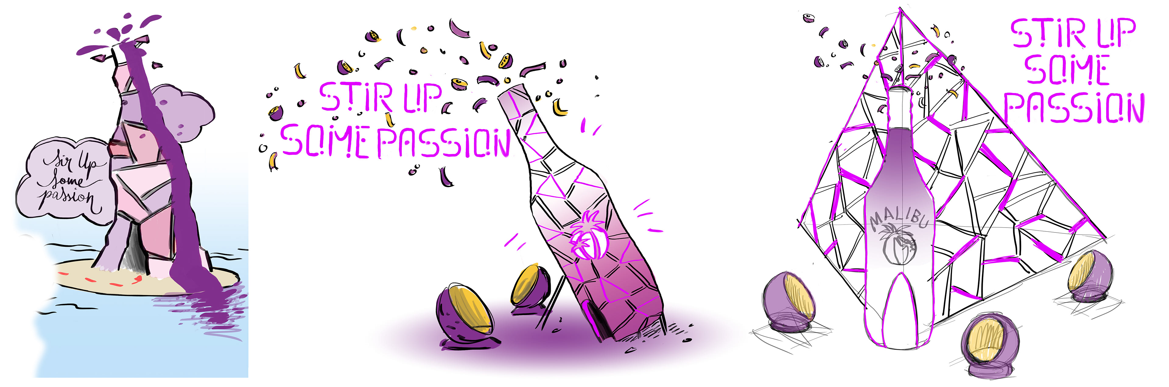
Early stages of the the "Stir Up Some Passion" Game/Icon: it was at first more like a glass volcano with a lot of facets. It became just un bottle (look close to the Malibu bottle "Passion Fruit" flavour. In the Third drawing you can see a pyramid shape behind the bottle. Neons light would light up all around the structure and highlighting the main bottle. Some design chair would be place all around the the game for spectators.
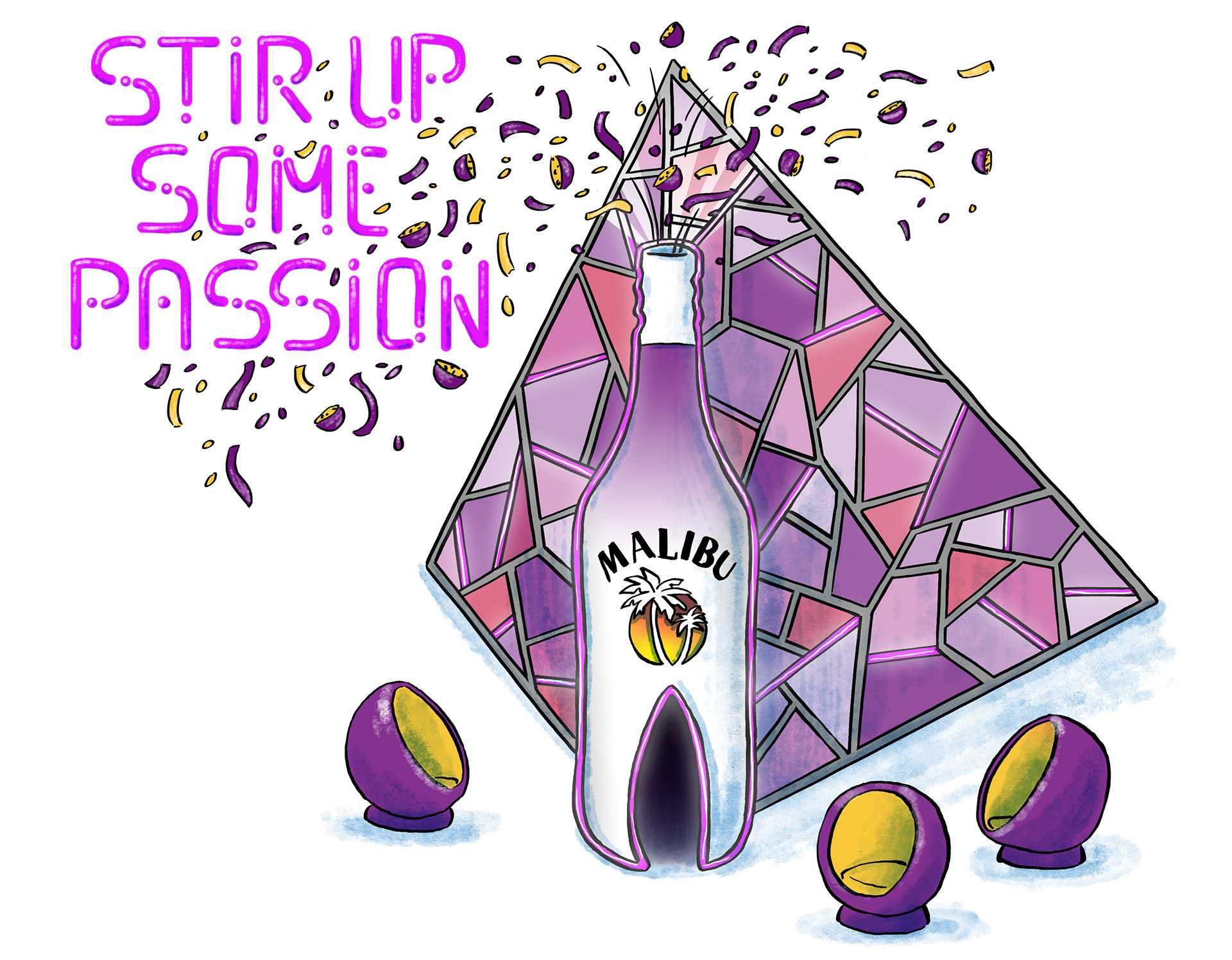
Final Illustration - Stir Up Some Passion
Above you can see the initial sketch and WIP. I use and isometric grid to create all the icons and elements for the maps.
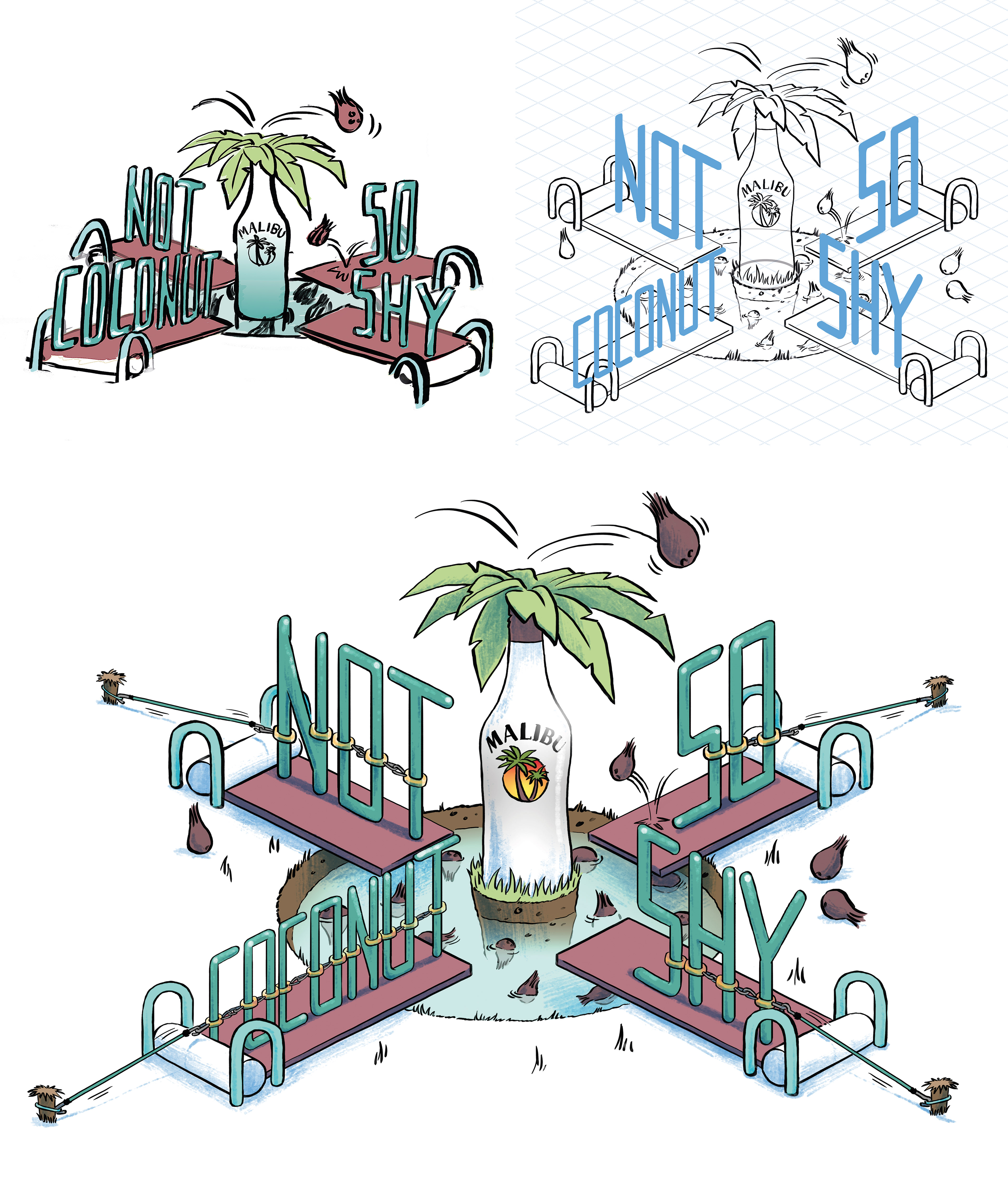
Final Illustration - Not So Coconut Shy
(the bungee ropes and the little pegs were added later to have a look closer to the final game design)
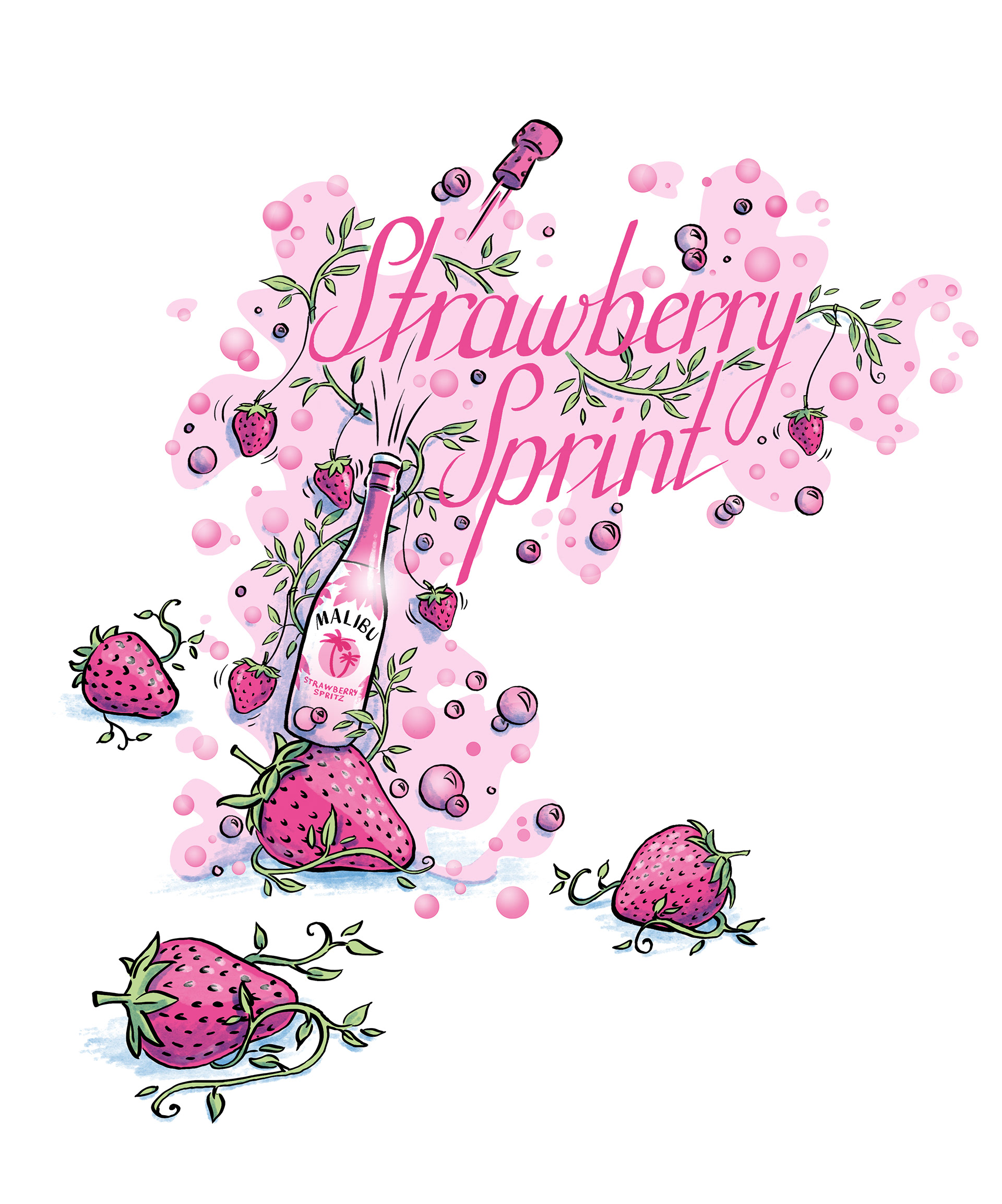
Final Illustration - Strawberry Sprint
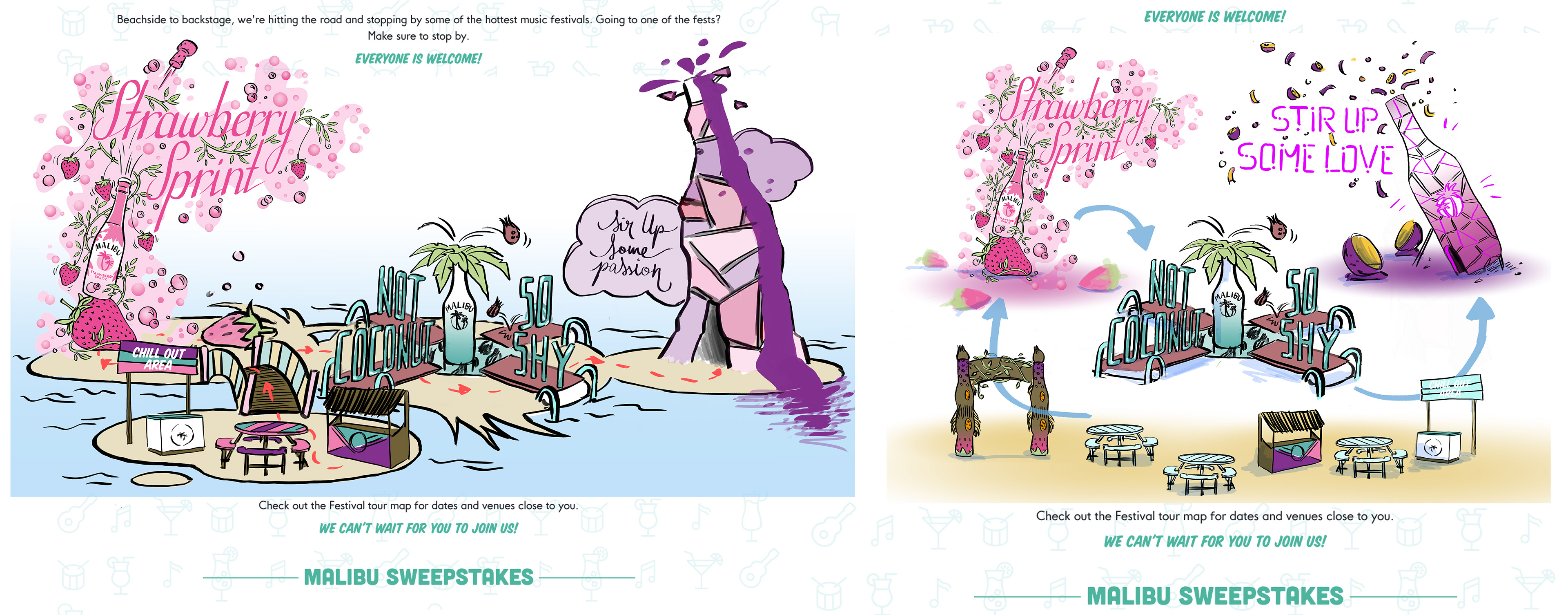
First mock up for the final look of the map, the idea to have the icons sitting on little island wasn't used in the end as it could have been confusing (the event wasn't taking place on island). The arrows will change to bring the people from the "Chill Out Area" to "Strawberry Sprint" to "Not So Coconut Shy" to "Stir Up Some Passion" and back to the "Chill Out Area".
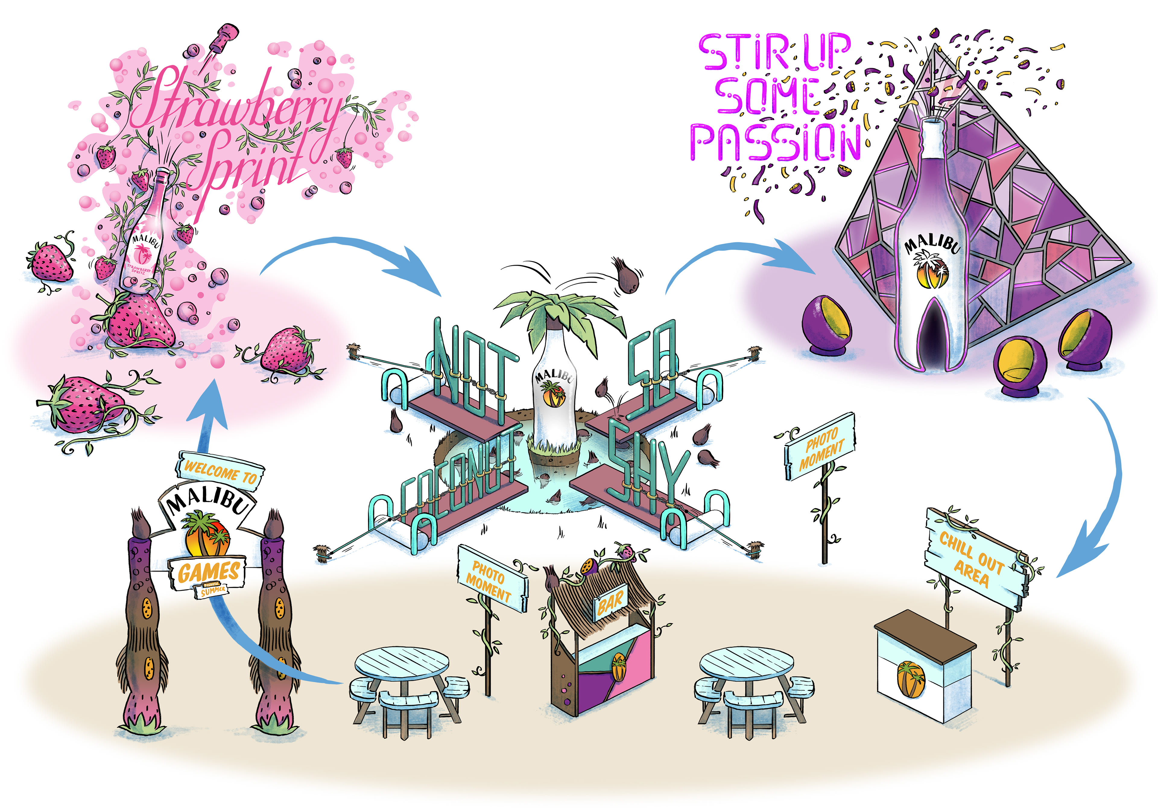
Final Artwork
Some of the element of the this illustration have been use in a >> short promotional video <<